We’ve been at it for several months now, but we’re finally finished with our Scottsdale Kitchen Remodel. Here is the final reveal, complete with before and after photos. This is a long post to read through, but I have so many exciting photos and so much information to share. It’s MY NEW KITCHEN. Yahoo!
The backstory:
We purchased our home in December 2018. It’s in a neighborhood in North Scottsdale, Arizona that we really love– one where we know quite a few people who live in the neighborhood already. There are walking paths, trees and large green park areas all around the neighborhood. We can walk to the gym and to restaurants from our house. It’s an ideal location for us.
We had been living in Scottsdale and looking at homes for a year and a half. Once we zeroed in on the location we liked best, we had our realtor keeping a close eye on houses that might be coming on the market for us. She showed us this house (15 years old), and after taking a peek… we saw that it had good bones and was a prime candidate for a Scottsdale Kitchen Remodel. It was also on a corner lot with great views and no neighbors looking into our yard.
Are we professional remodelers?
NO! We remodeled a little bit here and there when we lived in Northern Nevada, but we’re really learning as we go along. I must admit that we didn’t really plan to remodel the house as much as we did. But in walking through with our contractor, we kept adding to the list… and we ended up gutting most of the house and starting from scratch! The most important thing is to hire a contractor or project manager that you really like and trust. Look for (many) recommendations and do a lot of research before you hire anyone.
Remodeling the Kitchen:
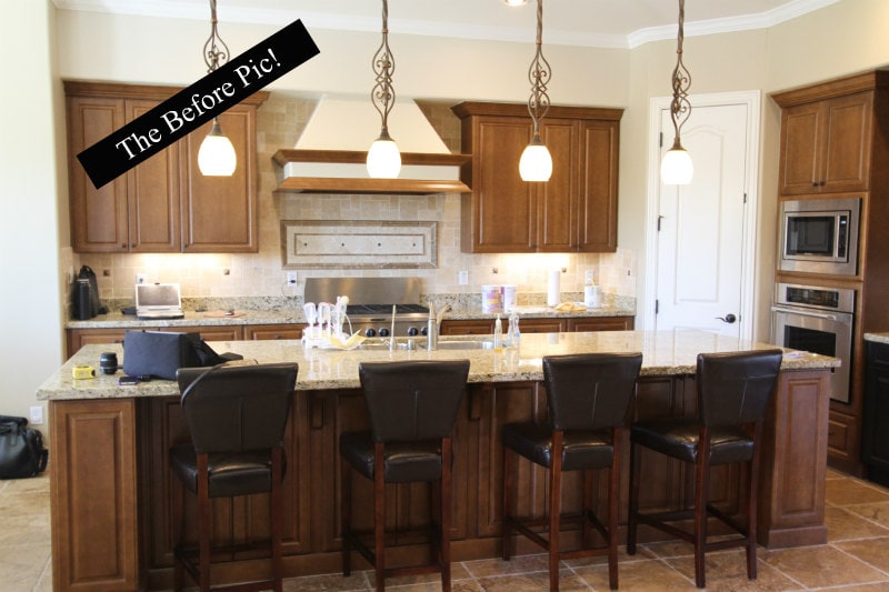
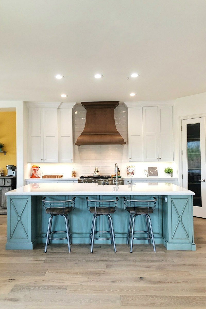
The kitchen and living areas were the most important to us. You’ll note in the “before” picture above that the existing kitchen was pretty standard– dark cabinets, basic granite countertops and stainless appliances. I’m sure it would have been fine for a lot of people, but it wasn’t the feel we were going for. We wanted a nice, light and bright kitchen. I wanted a kitchen that I’d be happy to work in, and I wanted a kitchen that would be a focal point for entertaining (which we do often).
McKenzie Architectural Kitchens worked with us on our Scottsdale Kitchen Remodel. We discussed functionality, relocating appliances, creating a larger island with a colored cabinet base, cabinetry that goes all the way to the ceiling, and a beautiful hood to display above my range. They were super easy to work with, and honestly… I couldn’t have made all of these decisions without a kitchen professional helping me.
Stools for the Kitchen Island:
Note about the stools at the counter. I looked long and hard and everywhere for the perfect stools. I took a chance and ordered these Carbon Loft Cantrell swivel metal barstools with wood seats on Overstock.com. They are perfect for our space. They were pretty easy to put together, and I love that they swivel ALL THE WAY around so you can turn around and see behind you.
The Cabinets:
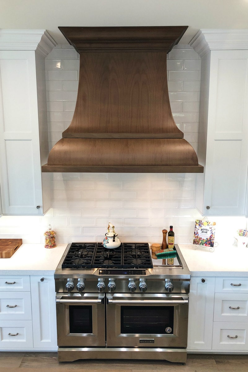
The white exterior cabinetry, the seafoam/sage green island cabinetry, and the hood were all ordered from Cabico Cabinetry. The white cabinets are from their more standard line. And the island is a little more custom- Cabico’s Elmwood Series. We couldn’t be happier with the cabinetry! It’s all very high quality, and all of the cabinets have the soft close feature (which means they don’t slam when you close them). I absolutely love that they go all the way to the ceiling (so much storage). I store all of my entertaining pieces way up high, and I keep a step stool nearby in case I need to get up there. Those two long skinny drawers you see next to the range are my spice drawers (spices displayed on slide out shelves- so handy).
By the way, I bought these non-adhesive, non-slip drawer liners to line all of the drawers in my kitchen and bathrooms, and I absolutely love them. They are super easy to cut, they lay flat, and the easily wipe clean.
The hood is amazing. It’s wood (custom, of course), and I love that it acts as a showpiece for our kitchen. I could have just gone with a stainless hood to match the range, but that would have been so boring! We’ve had a few social gatherings in our home already, and everyone comments on how pretty the hood looks.
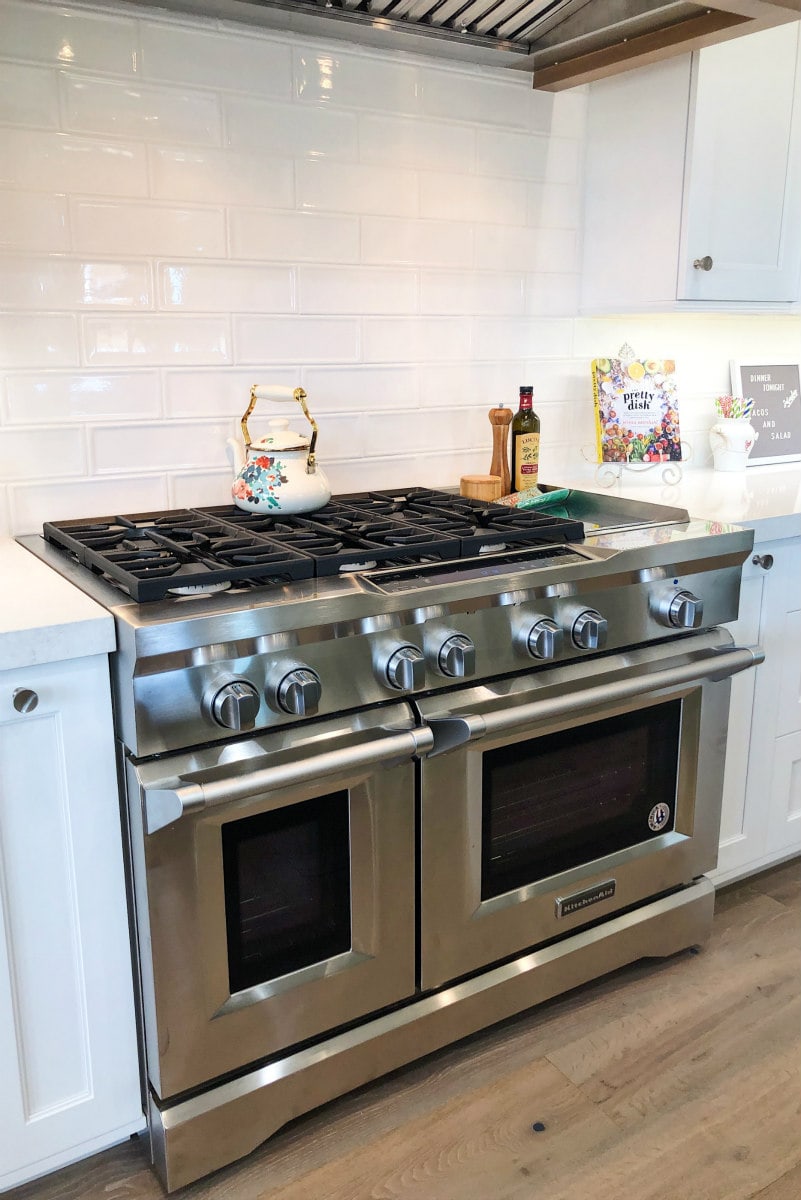
This is my new range from KitchenAid. It has six burners plus a griddle, and there is a large oven and a smaller oven underneath. I love that I was able to free up wall space by moving the ovens underneath the stove.
The subway tile backsplash (Uptown Astor Row) was purchased from Facings of America here in Scottsdale.
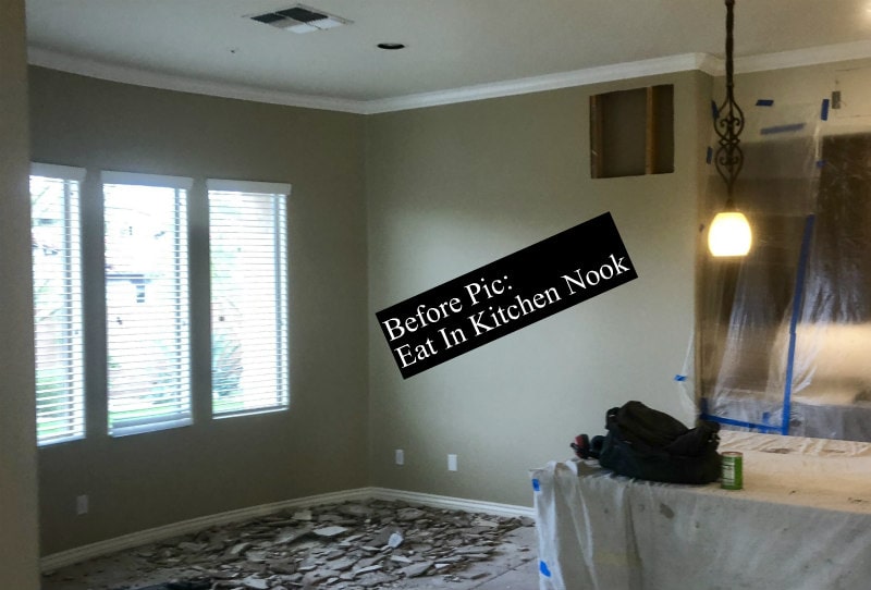
Creating a bigger kitchen nook area:
A peek at this eat-in kitchen area will show you what we did here. On that far wall, we decided to have our contractor pop that out to create more of a storage area. On the other side of that wall is a sitting area in the master bedroom, and it was large enough to allow for the expansion in the kitchen.
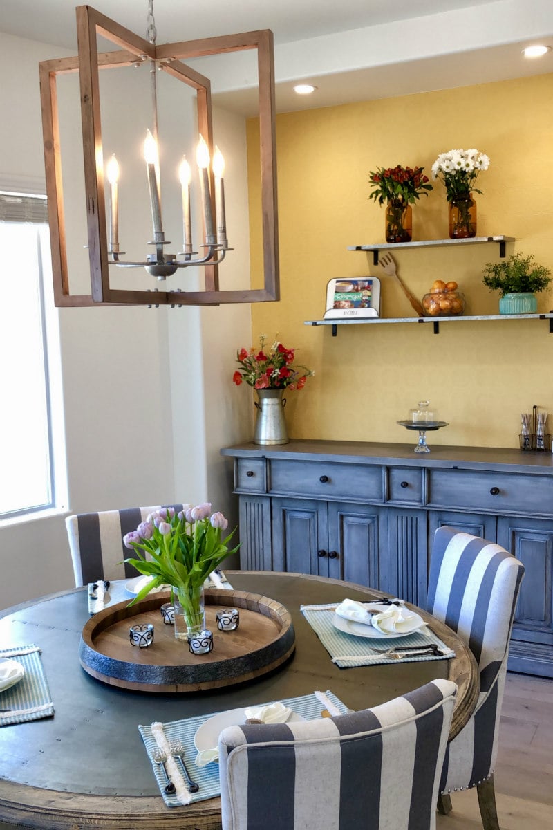
Here’s what it looks like after. The space is big enough to put a large piece of furniture (more storage), and we put our new Keurig Coffee, Latte and Cappuccino Maker on it and made it our coffee station area. It’s also a good spot to add decor to the walls (or shelving).
Furnishing details:
The table and sideboard were both purchased from Potato Barn here in Scottsdale. Those kitchen table chairs were a golden find at HomeGoods! The Daugherty 6-Light Square Chandelier was ordered from Wayfair, and the galvanized metal shelves on the wall were found at Pottery Barn.
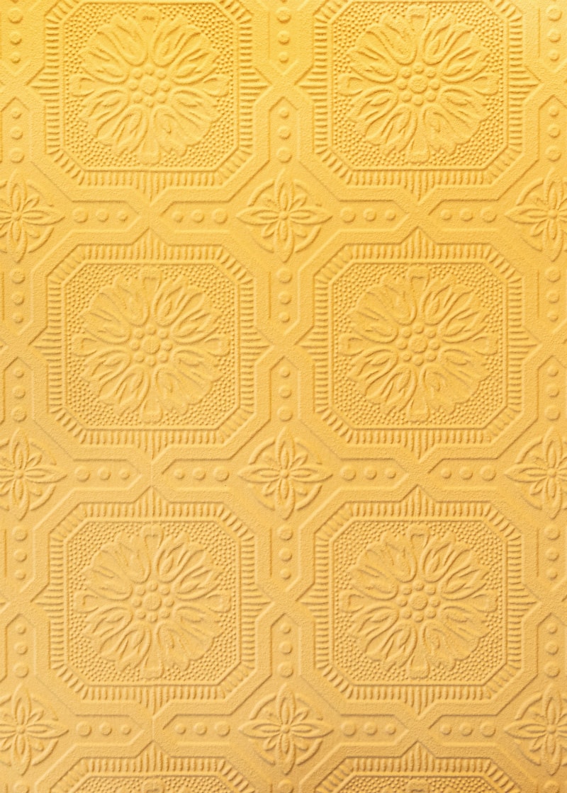
Textured wallpaper:
I had an idea to put textured wallpaper in the nook area. You buy it white, and then you can paint it any color just like you paint a regular wall. We opted for a yellow color, which complements the green island very nicely! The textured wallpaper was purchased from Wayfair.com. We painted it Mac N Cheese by Behr.
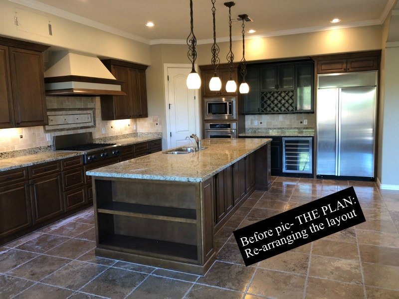
Changing the layout (the footprint) of the kitchen:
So when you look closely at the original layout of the kitchen, it’s not very functional. The refrigerator is so far removed from the stove and sink and the rest of the kitchen. I didn’t like that the ovens were taking up valuable wall space, and the sink was divided (something I don’t like at all!) Also, I had this same granite in two previous houses that we owned, and I was just so tired of it!
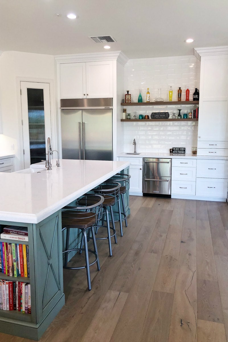
Here is the after photo of the re-organization. We moved our new (larger) refrigerator closer to the sink, and we created a bar area for my husband to play with. Also, we chose to eliminate pendant lighting and went with all canned LED lighting on the ceiling. Our kitchen design company- McKenzie Architectural Kitchens was so helpful in re-imagining a new layout!
Our wood flooring choice:
Metro West Wholesale is the company we ordered our wood flooring from. We chose French Oak “Moda” from the Mediterranean Collections by California Classics. I had seen the same wood floor brand at a higher end store in Scottsdale, and it was several dollars cheaper per SF at Metro West. They also gave us the names of wood floor installers, and we used one of their recommendations.
The pantry:
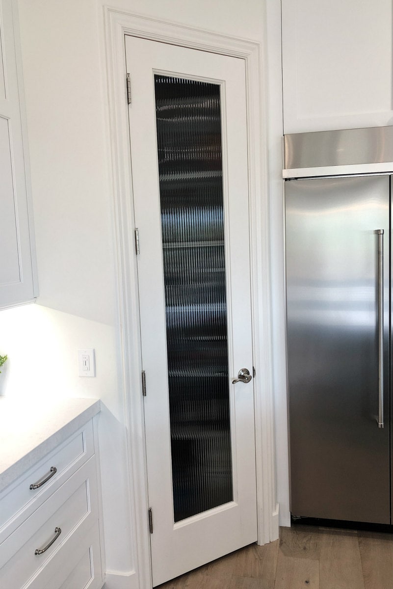
The pantry was pretty small, but we kept it that way and decided to keep it in the same location too. All we did was replace the door with a new one, and we put in reeded glass. It lets light through, but you really can’t see through it much. We also put in a sensor light in the pantry. The light goes on when you open the door, and it goes off by itself when you close the door.
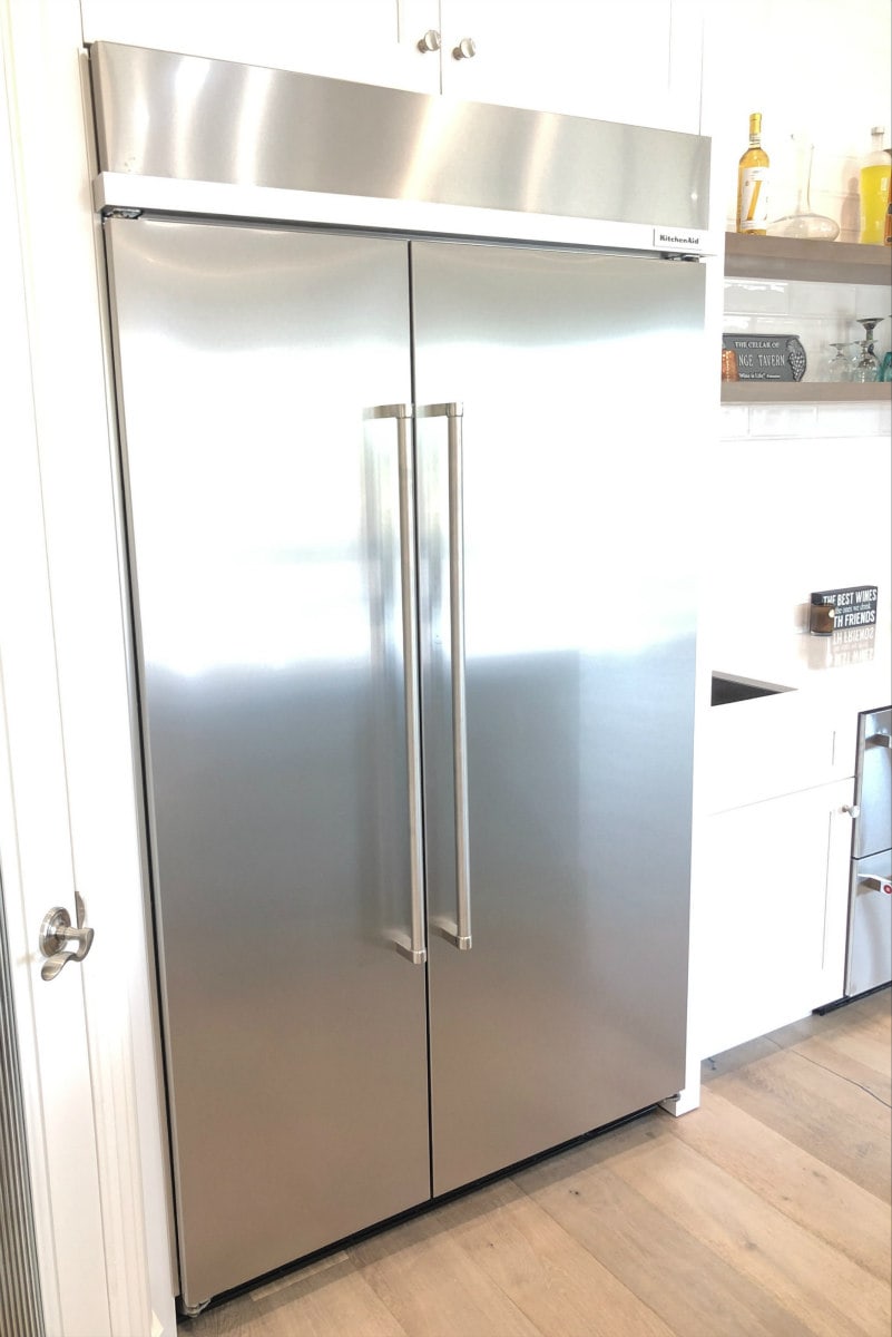
Our new refrigerator is from KitchenAid. Freezer is on the left. We opted not to get an ice maker within the fridge. We had one in our last house, and after a few years it started oxidizing and didn’t look so great. I love the look of this refrigerator and there is good storage in the refrigerator section, but the freezer is a bit on the small side.
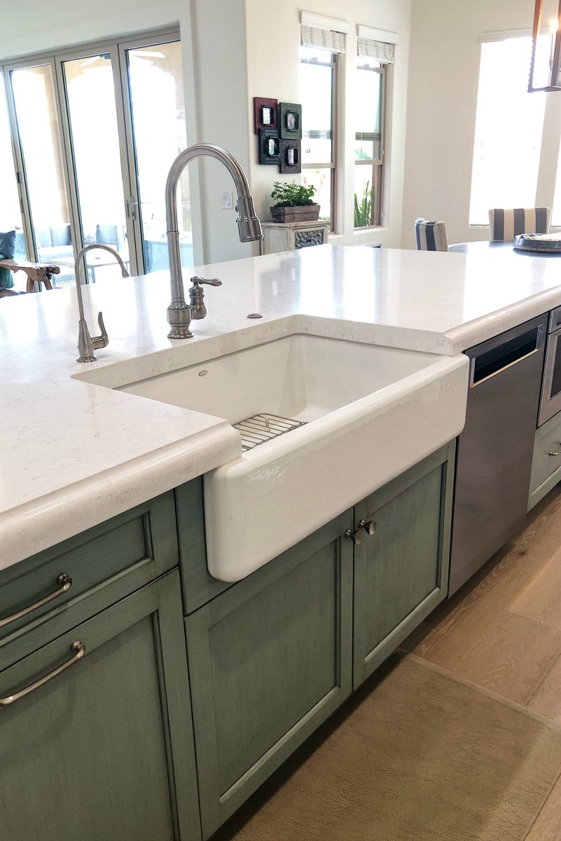
We chose a Kohler farmhouse sink and Kohler plumbing fixture too. I love having a one-basin sink! The little spout on the left is a reverse osmosis system that spouts out filtered water. I ordered all of the cabinet hardware knobs from Wayfair.com (Shelley Mushroom Knobs and Shelley Center Arch Pulls from Atlas Homewares). I did everything in “brushed nickel.” Buying them sight unseen was a little worrisome, but they look great and they’re nice quality too.
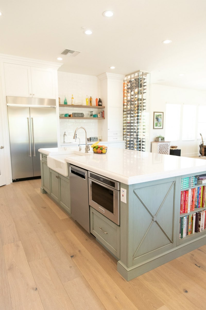
The dishwasher and microwave drawer are both from KitchenAid. The dishwasher is a powerhouse, and it works great! I think we need to have our contractor set the microwave a little bit further into the island because when I’m working at the counter, I accidentally turn it on or open it quite often. Does anyone else have this problem with their island microwave??
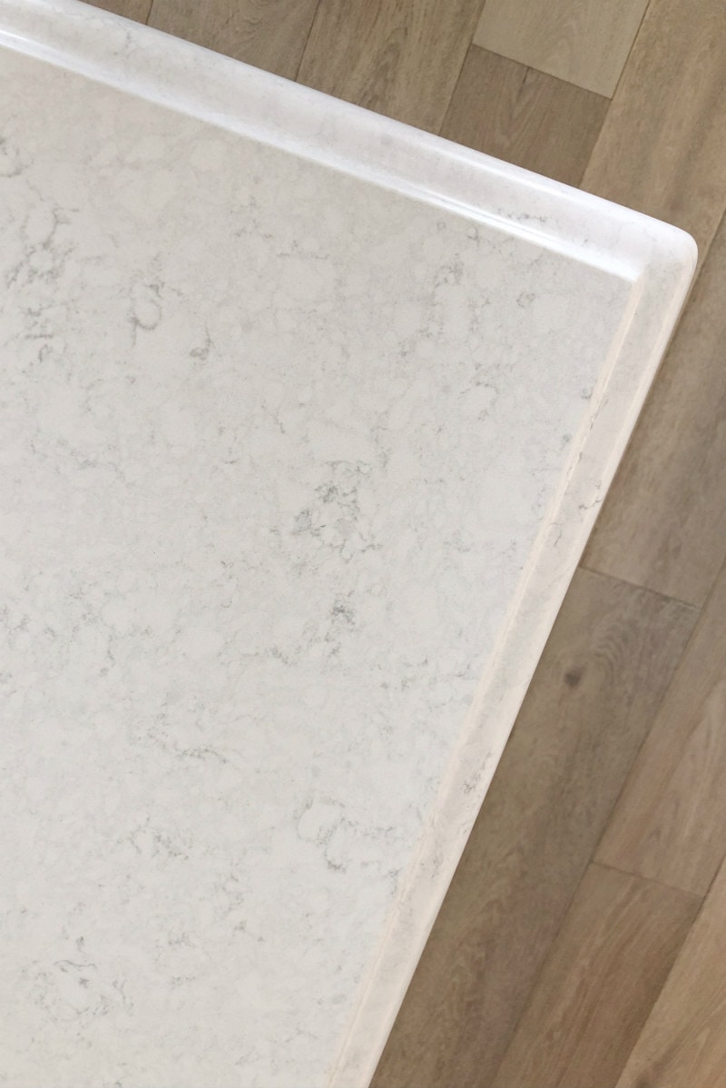
The countertops:
These are the countertops we chose from Cactus Stone & Tile here in Scottsdale. We decided on Quantra Calacatta Frost Quartz. It’s white with a little bit of gray swirl in it, and we were able to get the island fabricated in ONE piece with no seams. Our exterior countertops are the same. I love them! They’re so white and clean and pretty. And they’re easy to clean too.
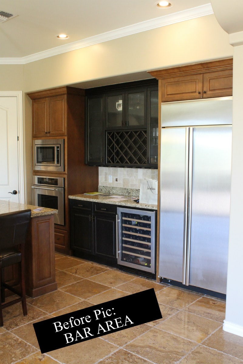
In our house in Northern Nevada we had a large bar area that was perfect for entertaining. My husband loved it! This new house is much smaller– our empty nester house- and there is a bar area, but it was quite small. We wanted to make it a little more functional.
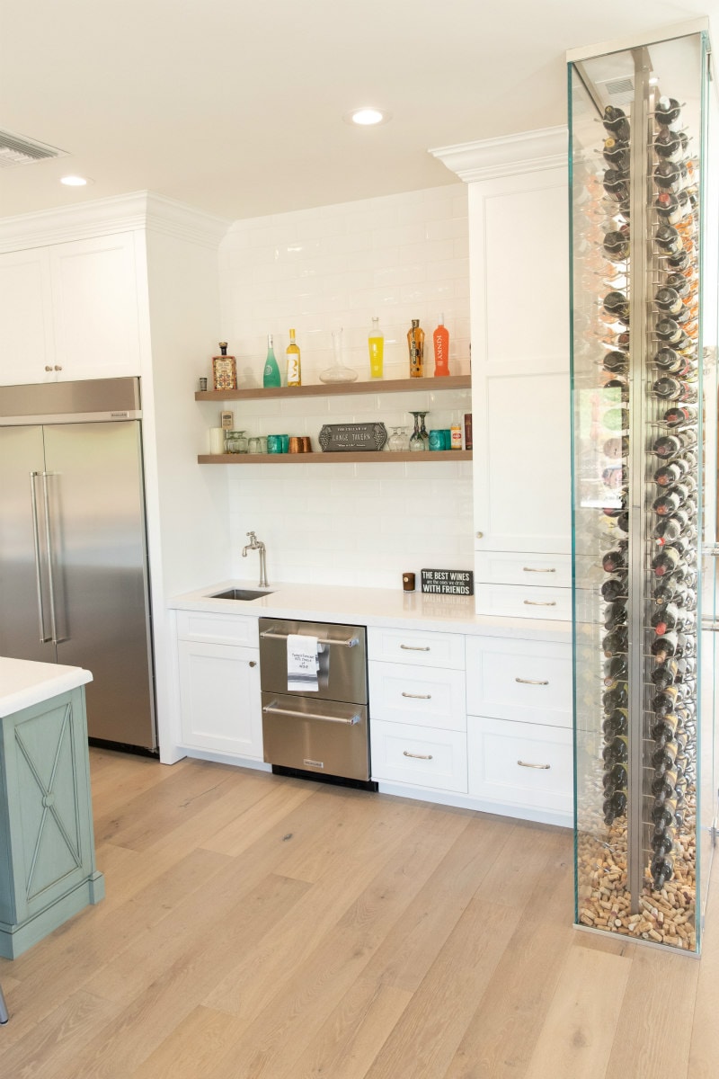
Creating a beautiful bar area:
We put in a small bar sink, and we added KitchenAid refrigerated drawers to store waters, sodas, beer and open bottles of wine. We were able to expand the countertop a little bit since we took out the wall ovens. And we added shelving above to house some glassware and our more decorative bottles of liqueur. Oh, and you might spy a wine wall on the right. More about that below…
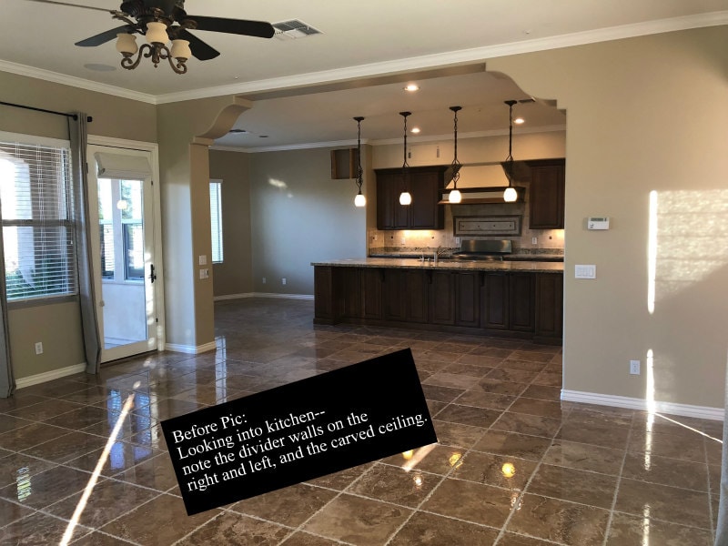
This is a good shot showing what the kitchen looked like before we started the remodel. You can see that the kitchen was very much a “separate room” because of the divider wall on the left and the divider wall on the right. The carved ceiling feature made it feel kind of contained and closed-in too.
Opening up the room:
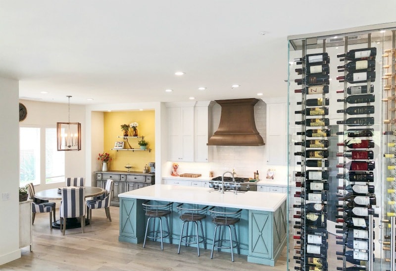
AFTER! We took out both divider walls and those carved ceilings too. The ceilings seem so tall now, and everything feels very open and bright. We turned it into one big, great room instead of two. The divider wall on the right was replaced with a wine wall.
Adding a wine wall:
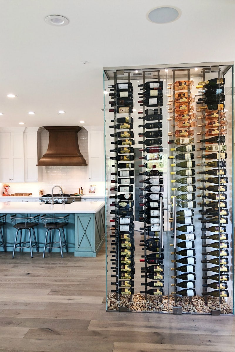
We could have taken out that right divider wall completely and really just opened up the kitchen fully. But we love wine… and we love to entertain. We called Innovative Wine Cellar Designs here in Scottsdale, had them come out to the house, and shared our vision with them. It was the perfect place to put a wine wall!
And because the wall is made of clear glass, it wasn’t going to close off the room like the divider wall did. You can see through the wall, and it lets in light too. This is a floor-to-ceiling refrigerated wine wall. It is kept at 58 degrees (optimal for red wine.) We do store both reds and whites in there. When we know we’re going to want to enjoy a bottle of white, we simply move it to the refrigerator for a while to chill it a bit more.
Innovative Wine Cellar Designs will design your wine storage for you. We simply told them what we wanted, and one of their designers got to work and made it happen. Our design holds 216 bottles of wine. We haven’t been able to fill it up yet, but we’re trying!!
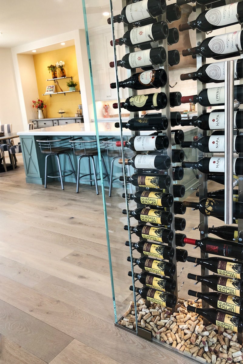
My husband and I worked for a good number of years to accumulate that many wine corks. Now we’ve found a use for them. The bottom of the wine wall is just our wood floor, but we thought it would be fun to add the corks to the bottom. We are so happy that we decided to splurge and add this feature to our home. It’s definitely a showstopper for entertaining (everyone comments on it), and it’s a helpful space to store our wine too.
FYI: The wine wall has a lock! This is important to keep the wine safe from kids in the house or people who might be house-sitting or whatever. We keep it locked at all times 🙂

That’s it! We love everything about our Scottsdale Kitchen Remodel. It’s light. It’s bright. And it’s perfect! We love it for entertaining. Everyone wants to hang out in the kitchen with me! Next I’ll be sharing the remodel of the living area, hallway and outdoor patio area. It’s such a big transformation, so I can’t wait to share it with you!
By the way, I wanted to mention: I know that a lot of people might have been happy with our kitchen and our home the way it was. It just wasn’t our style, so we chose to remodel. We didn’t throw ANYTHING away except the flooring and some of the countertops. We were able to sell all of the old cabinets, appliances, light fixtures, fans, sinks, etc… and anything we were not able to sell, we donated to a charity organization. Many people who were remodeling their own kitchens were able to re-use the things that we didn’t want anymore!
Here’s a list of the chosen companies we used for our Scottsdale Kitchen Remodel:
- Our contractor is a good friend of ours who does select projects in the greater Phoenix/Scottsdale area. If you are interested in his contact information for a potential project, please email me and I can share that with you.
- We worked McKenzie Architectural Kitchens on the design of the layout of the kitchen and assistance with choosing the cabinetry and range hood from Cabico Cabico Custom Cabinetry. Our experience in working with them was very positive and professional, and we are extremely pleased with it all!
- Metro West Wholesale was the company we ordered our wood flooring from.
- The countertops were purchased from Cactus Stone and Tile. We love our countertops, and Cactus Stone and Tile were super easy to work with.
- The backsplash tile was purchased from Facings of America.
- We hired a fantastic tile company who installed all of the tile and countertops in our remodel. If you are interested in their contact information, please email me and I can share that with you.
- All of our appliances were ordered from KitchenAid, and all of the plumbing fixtures are from Kohler.
- Innovative Wine Cellar Designs designed and installed our refrigerated, floor-to-ceiling wine wall. WE LOVE IT SO MUCH.
- Our designer: Leslie Paige Interiors (helped with tile design and general advice on kitchen design decisions)
- Our realtor: Tracey Gray from Sotheby’s in Scottsdale was easy to work with and the sale went smoothly. I recommend her!





Just love your kitchen. What a difference in the before and after. Question, were your white cabinet doors wood or MDF? I live in Las Vegas which is dry like your area. I’m not sure which way to go as I want painted cabinets like yours. I’m fearful the white painted doors might crack/shrink a bit at joints.
Thank you! The old cabinets were old– falling apart. I think they were wood, but in need of replacing. The white cabinets are wood. I think it’s natural over time for them to shrink a bit in places, but I don’t expect cracking. I would investigate several manufacturers and see what they say. We’re really happy with the Cabico brand.
Wow, it looks amazing. I love the seafoam color on the island and that wine wall is the coolest thing ever! Great job!
Thank you!
Thank you for sharing your new kitchen with all is of us! Beautiful!
You’re welcome, and thank you!
Great job Lori! I am sure you are so happy with your new space and that the work is done. It turned out so well! And I love the wine wall and I am sure everyone does comment on it. It’s so unique and also so practical!
This is so beautiful. What a great job everyone did. I love the wine wall.
Thank you!
I love it! It’s so perfect! You really took a so so kitchen with issues (the bar was off and the tile was so dark along with the dark cabinets, no contrast or lightness at all) and made it more than perfect. Love it!
Thank you!
What a beautiful job, Lori! The design and execution are beautiful. It is clean and has a lot of show pieces. I love the wine wall and the good. Wow! Great work.
Thank you so much- we worked so hard to make it exactly what we wanted!
Seriously gorgeous! I love your style and the wine storage is so creative!
Thank you, sweet friend!
If anyone wants a wine cellar, contact Innovative Wine Cellar Designs in Scottsdale!
Yes, that’s who we used.